The Master Fader of Responsive Web Design
Master
If you’ve ever played around with a soundboard to record music or mix a live band, you know the individual volume faders are all linked to the master fader. You want to turn everything up? Boost the master fader.
Well did you realize the web has it’s own equivalent to the master fader for proportionately scaling a website to fit the browser and device being used?
It’s the HTML element. Makes sense, right? It’s the container that holds all your content. We know that styles cascade on the web, allowing elements to inherit the properties of their parent containers. What may not be as obvious is how we can use this to ensure moving the master fader (changing properties on the html element) proportionately effects every other element on the page.
When I first began building responsive websites, it was a natural instinct to look at sections of content or individual elements in isolation. I’d shrink and expand the browser, writing new styles wrapped in media queries for everything, until it matched my desktop, tablet, and mobile mockups. Not only was I doing too much work, but I was writing heavy code, and wasn’t letting the web naturally scale itself.
The Stage Plot
Using pixels as a unit of measure can be confusing these days because pixels are also used to talk about screen density. However…
Until design tools like Figma start measuring dimensions and font-sizes in units other than points and pixels, I’ll always be converting to pixels in my head.
This may change over time, but pixels are my frame of reference and my starting point for insuring a UI “fits” the form-factor it’s being designed for. I know what the minimum pixel height of a button should be to remain tappable on a mobile device. I know the font size in pixels that paragraph text should be to remain legible. But the magic of our master fader comes as a result of using rems, and not pixels, for pretty much every measurement…everywhere. So let’s talk about rems, but relate them back to pixels to make sense of it all. If you haven’t worked with rems, here’s the scoop:
Rem stands for “root em”. Not to be confused with regular Ems — which reference the font-size of every ancestor, all the way up the DOM — Rem units say “forget you, ancestors”, I’m going straight to the source and referencing the root element.
Rem values get multiplied by the font-size on the html element. They can replace pixels and be used as the unit of measure on any CSS property. Font-size just happens to be the root element property they reference for scaling. Rems make it possible for every CSS measurement, across an entire site, to reference a single value on the root html element. Great! But why is this helpful?
Wire it Up
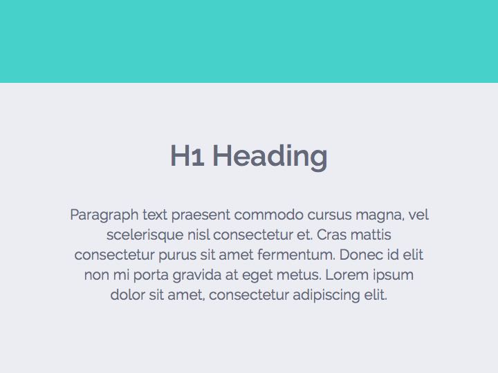
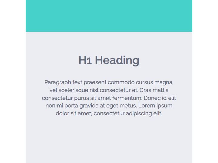
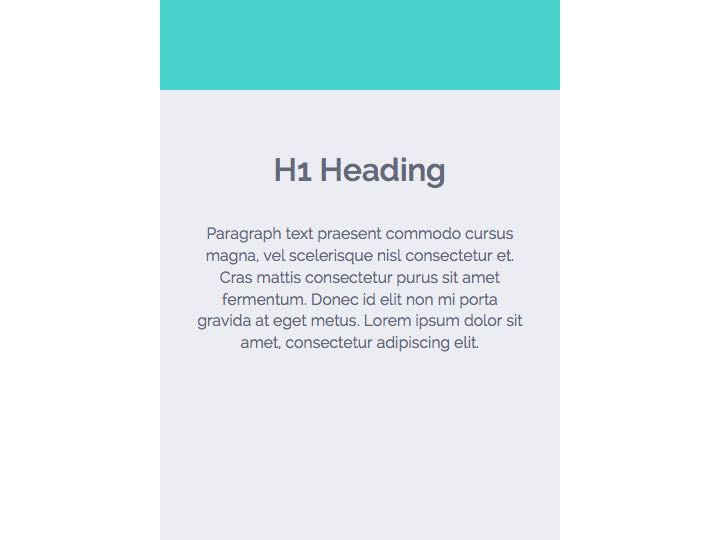
Illustrated below are three page elements — a header, an h1, and a paragraph block. See the way they scale down proportionately at each breakpoint? The header height and vertical space between elements gets smaller. Font sizes reduce. This is all due to a single change being made to the font-size on the html element…our master fader.
Below is a snippet of code showing how these three elements are wired up. I’ve written this in Sass to make things more conceptually clear. I’ll include my media query breakpoint variables and Sass mixins at the top, so references to “bears” make sense:
    /* Breakpoints */

    $mama-bear: 1100px;
    $baby-bear: 650px;

    /* Media Queries */

    @mixin bp($point) {
        @if $point == mama-bear {
            @media (max-width: $mama-bear) { @content; }
        }
        @else if $point == baby-bear {
            @media (max-width: $baby-bear)  { @content; }
        }
    }

    /* Master Fader */

    html {
        font-size: 100%;

        @include bp(mama-bear) { font-size: 87.5%; }

        @include bp(baby-bear) { font-size: 75%; }
    }

    /* Stuff I'll Wire to My Master Fader */

    header { height: 5rem; margin-bottom: 3.75rem; }

    h1 { font-size: 1.75rem; }

    p { font-size: 0.875rem; }
Here’s what’s happening (in pixels):
When the browser is smaller than 650px:
- header has height: 60px; margin-bottom: 45px;
- h1 has font-size: 21px;
- p has font-size: 10.5px;
The font-size of the html element at this breakpoint is 12px — that's 75% of 16px(the default browser font size). To get the pixel values above, I multiplied each element's rem values by 12px.
When the browser is between 650px and 1100px:
- header has height: 70px; margin-bottom: 52.5px;
- h1 has font-size: 24.5px;
- p has font-size: 12.25px;
The font-size of the html element at this breakpoint is 14px — that's 87.5% of 16px(the default browser font size). To get the pixel values above, I multiplied each element's rem values by 14px.
When the browser is larger than 1100px:
- header has height: 80px; margin-bottom: 60px;
- h1 has font-size: 28px;
- p has font-size: 14px;
The font-size of the html element at this breakpoint is 16px — that's 100% of 16px(the default browser font size). To get the pixel values above, I multiplied each element's rem values by 16px.
If you’d like to see this in action, I made a Codepen demo here.
Sound Check
You may be wondering how I arrived at the font-size percentages on the html element. It’s a subjective game of trial and error. Play around with your master fader, and pay attention to the big picture. If most elements on the page feel appropriately sized on devices that map to each of your breakpoints… you done good. With the html element doing most of the work, now it’s time for a little fine tuning.
Let’s say, for instance, you notice when the browser is at phone size, the paragraph text feels a bit small. This is the case in the example above. The paragraph font size is only 10.5px when the browser is less than 650px. That’s pretty small text. But the size of everything else feels great. In this case, I’d add a media query to my paragraph, like this:
    p {
        font-size: 0.875rem;

        @include bp(baby-bear) { font-size: 1rem; }
    }
Boom. Now the paragraph font-size on a phone is 12px.
Ready for Any Venue
There’s a certain comfort in knowing all the elements on a website are interconnected and proportionately scale up or down together. When the next gigantic phablet comes out and fashion regresses to the accommodating pockets of JNCO Jeans, your site will feel right at home on that monster. Apple Watch? Add an even smaller breakpoint and squeeze that html font-size percentage down. Yeah, okay, I won’t be using the web on an Apple Watch either. But you get the point ;).
Note: If after reading this, you’re like “I hate music. And what’s a fader? I don’t like this at all. Fail.”… well, you should check out Uncle Trent’s Post — different perspective, same important topic.
Here’s to lean, form-factor-fitting, responsive web design.