Hi I'm Josh Holloran, a in Portland, Oregon.
Product Designer
Design Director
UI/UX Specialist
Visual Brand Designer
Static Website Developer
Native iOS & Android Designer
Web App Designer
Copywriter
Products
Small Business LendingCase Study
Problems
User Persona
Loan Applicant (Brokers & Business Owners)
- Applying for a U.S. Small Business Administration (SBA) loan requires filing lengthy government PDFs that can be vague, confusing, overwhelming, inconsistent, and time consuming to complete.
- Data and documents requested from applicants are often incomplete or incorrect.
- Interviews with brokers and business owners revealed they would like help throughout the process of applying.
- Manually collecting information and signatures via email from multiple business owners is a pain.
Opportunities & Objectives
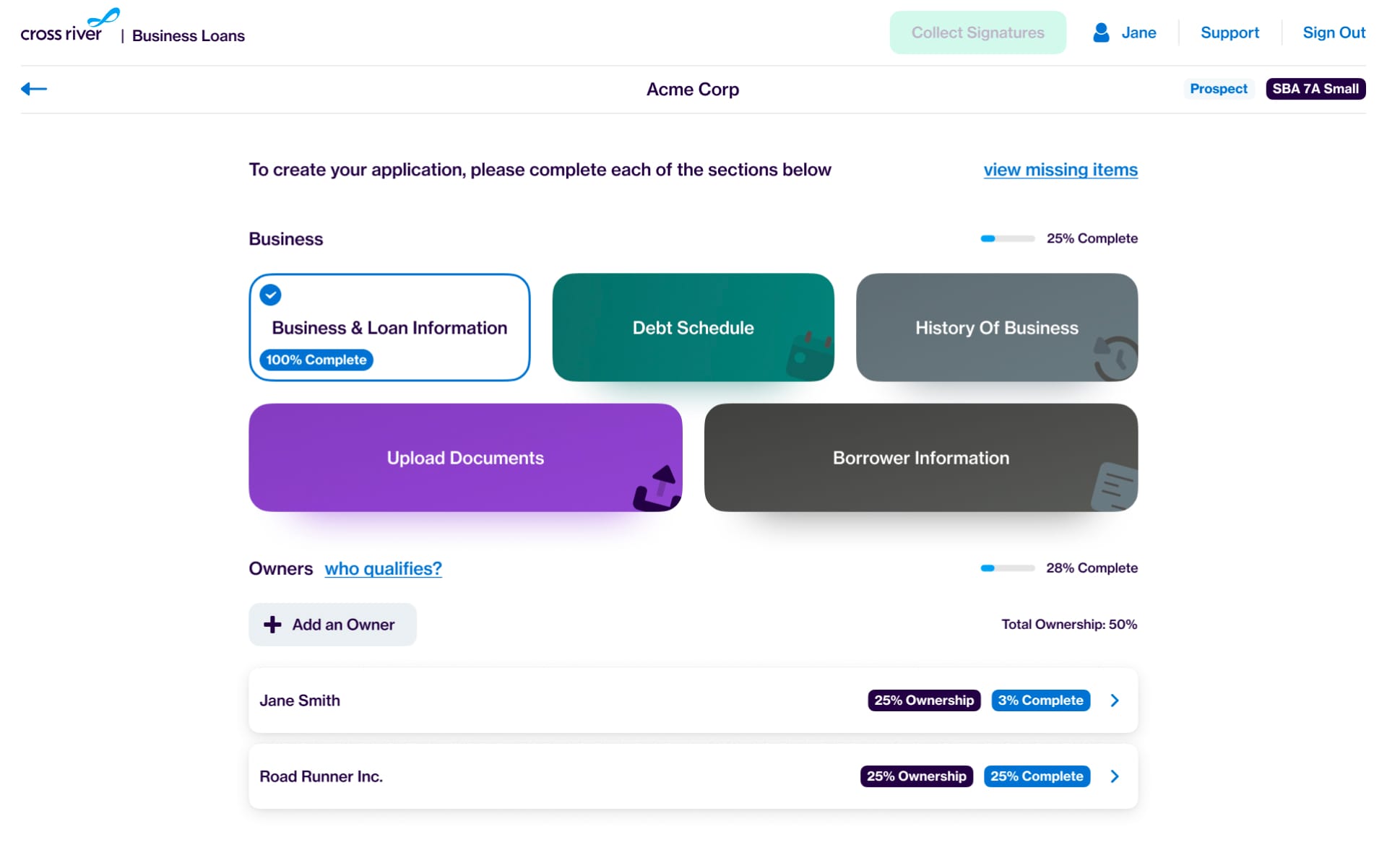
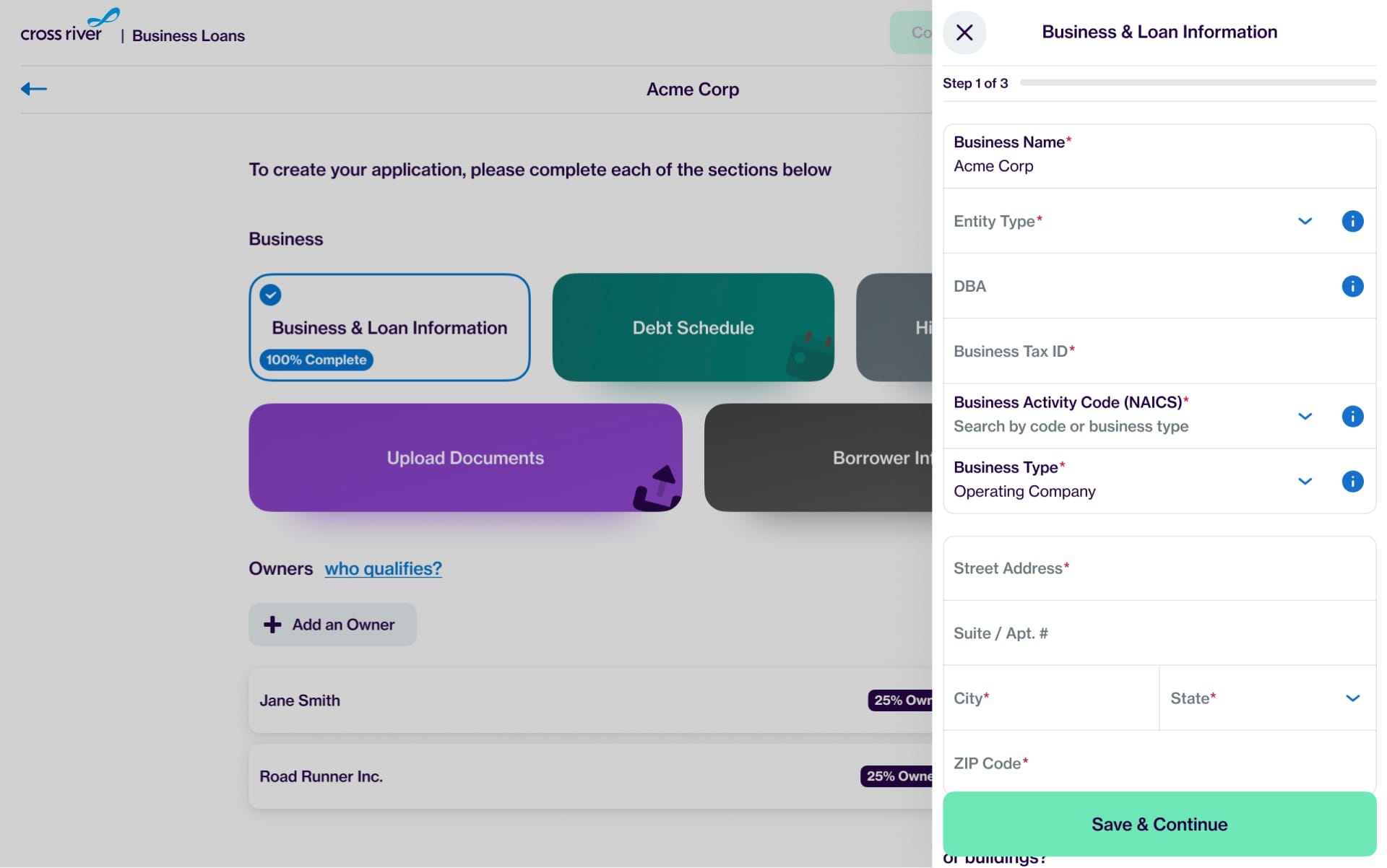
We identified an opportunity to make the application process more efficient and user-friendly for brokers and owners. We decided to build a web app to collect the required information and documents to apply for SBA and other small business loans. I began organizing the collection of this required information into more logical sections and digestible steps. Each form field in the app was then mapped to one or many fields in the required PDFs for submission.
Exploration
Based on market research and my previous user testing for onboarding flows, I quickly narrowed in on two optimal layouts for the application process ...
Option 1
Option 2
In the end, Option 2 was a better fit for the nature and amount of information being collected. It also better satisfied our desire for a fully responsive interface—one that retains its form and function from large desktop screens down to mobile devices.
At smaller screen sizes, there’s no room for the side navigation in Option 1. This reduces the layout’s effectiveness at providing users context for where they are in the process.
Design
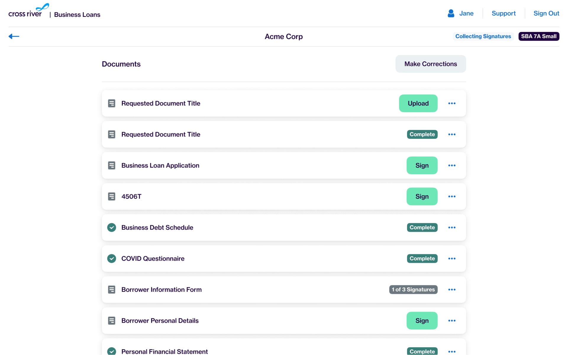
To address the problems outlined for applicants, my designs achieved the following:
- Provided contextual information to alleviate confusion about complex or ambiguous requests.
- Reduced cognitive load.
- Improved completeness and accuracy by clearly communicating percent complete, and highlighting incomplete/invalid info.
- Automated the collection of information and signatures from multiple business owners via the app.
User Testing
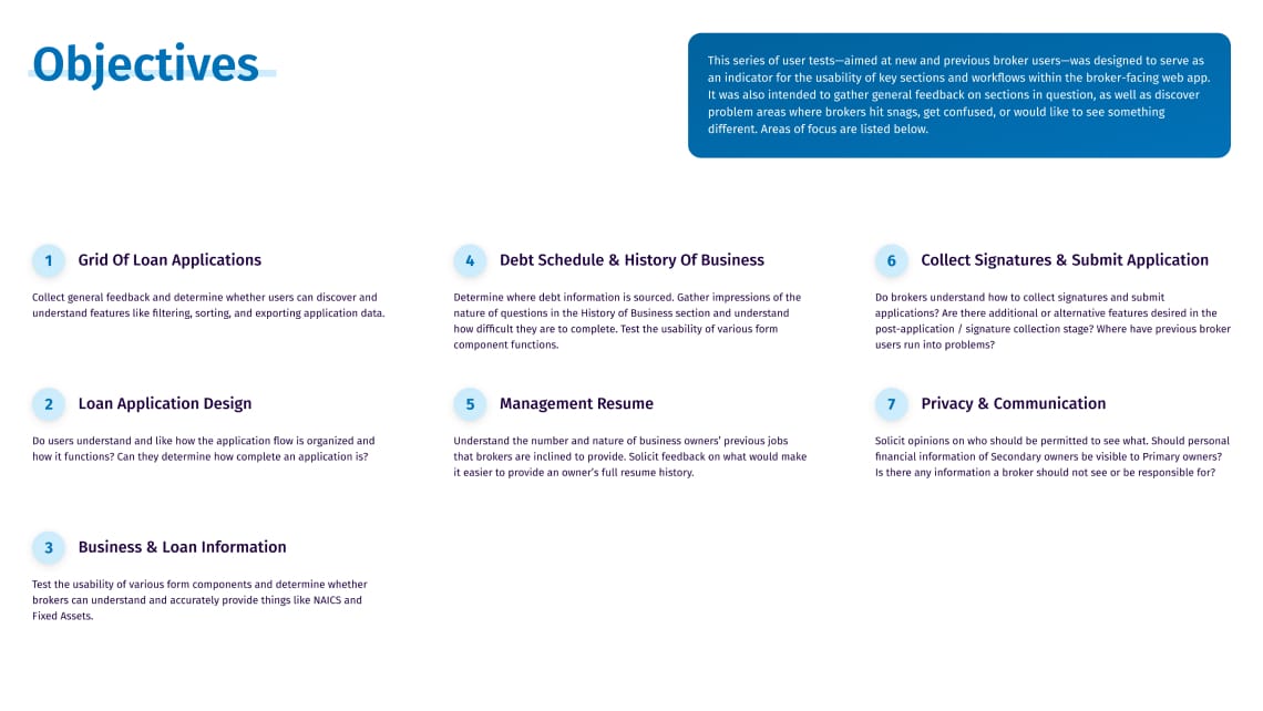
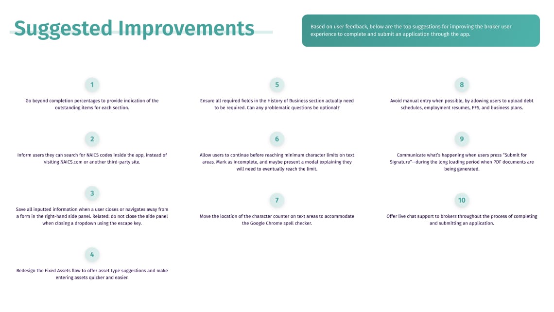
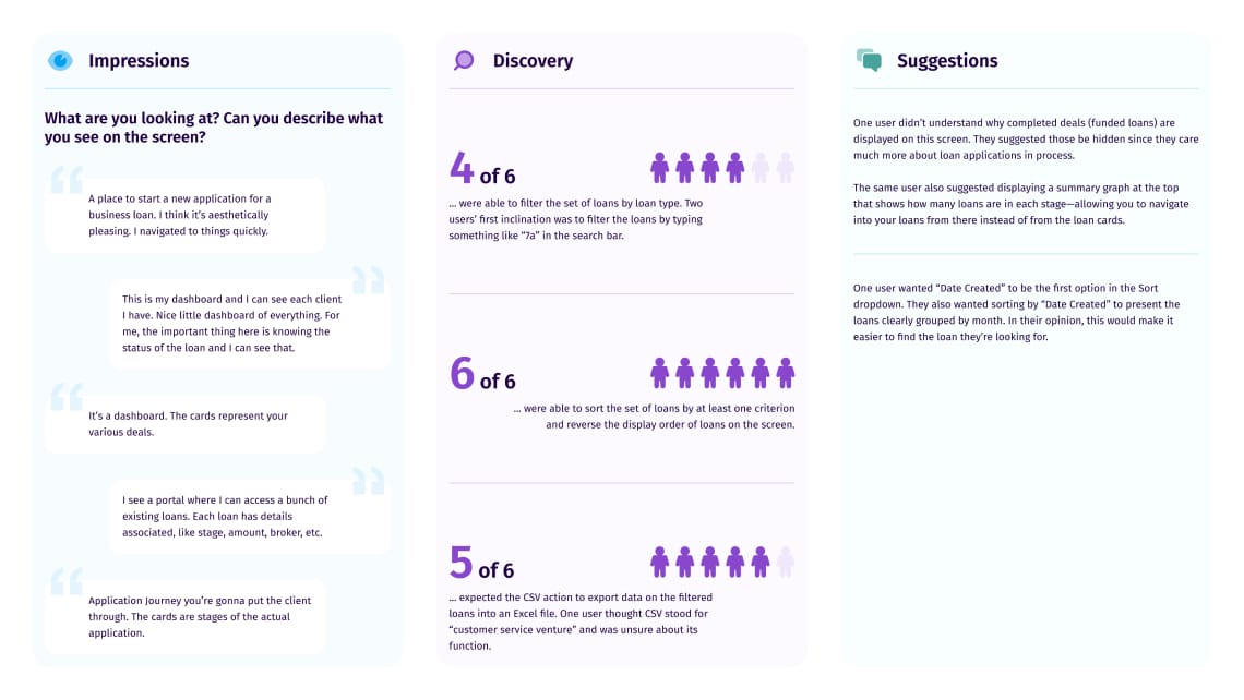
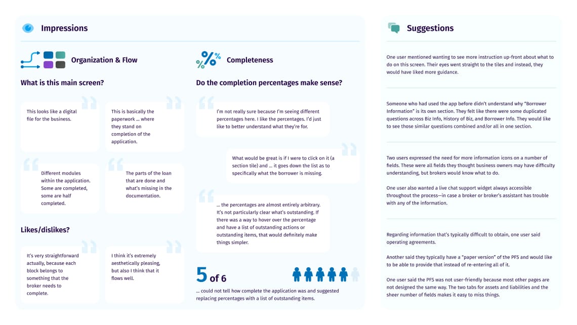
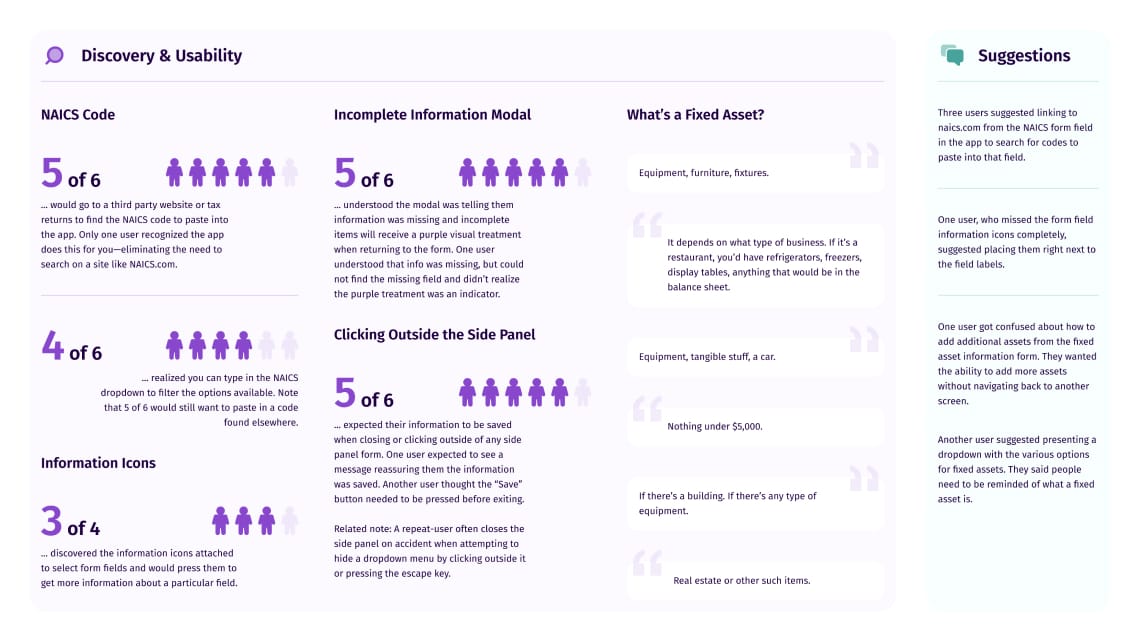
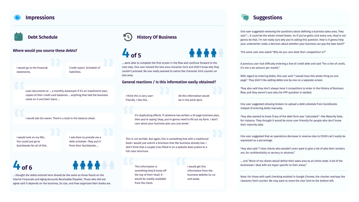
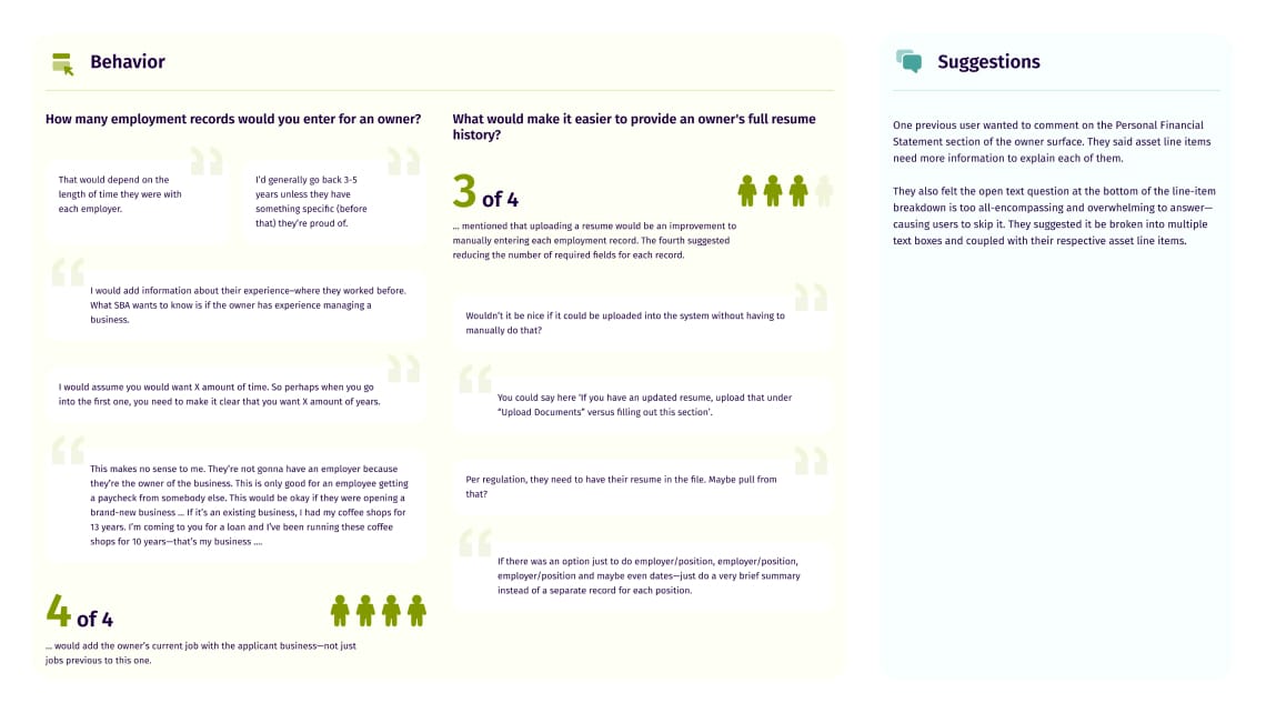
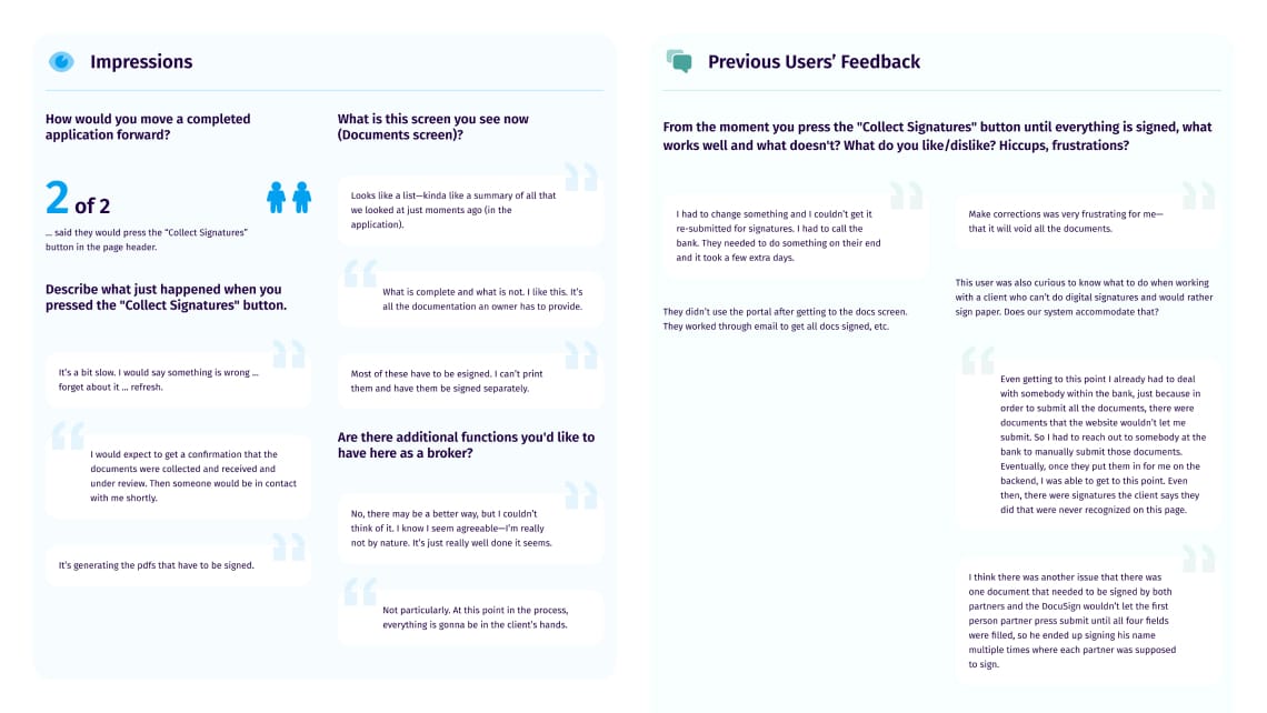
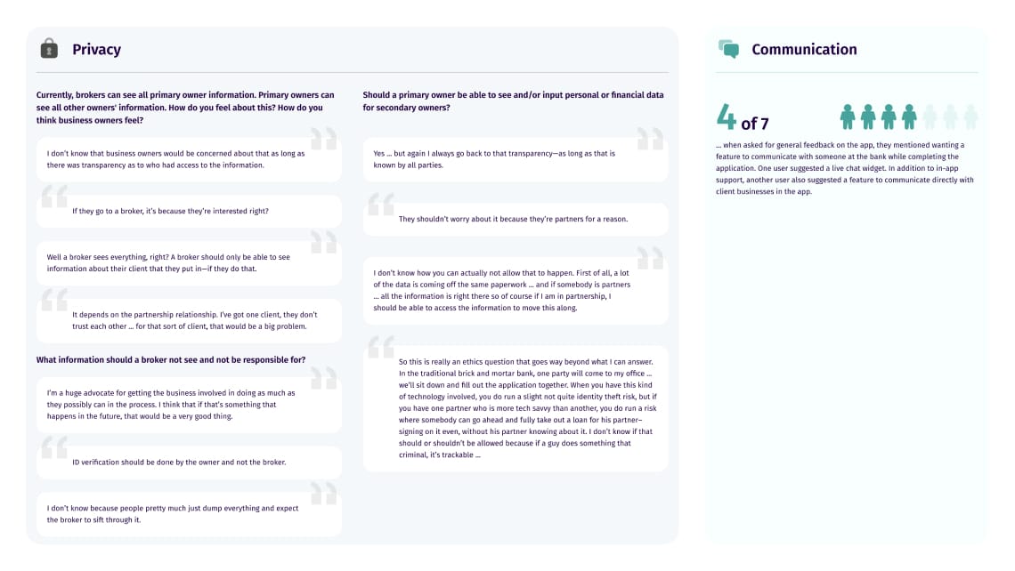
After launching the first version of the app, I compiled a list of things we were curious to know about the way people used and perceived the app. I composed a user testing script and conducted 45 minute interviews with brokers and business owners. From those interviews, I created a qualitative summary report to present to business stakeholders and my team of product managers and developers.
The feedback was very positive and constructive. People loved how easy we made it to apply for a loan and sign documents.
It’s very straightforward. Each block is a well-organized group of information the applicant needs to complete.
It’s extremely aesthetically pleasing and flows very intuitively.
There may be a better way to do this, but I can’t think of it. I know I seem agreeable—I’m really not by nature. It’s just really well done it seems.

Problems
User Persona
Loan Reviewer/Underwriter
- Time to process and decision loans is too long.
- Underwriting worksheets are inconsistent from one underwriter to the next.
- Loan documents are scattered across manual email requests.
- Application life-cycle management is manual and cumbersome.
Opportunities & Objectives
After launching the broker/owner-facing app, we saw an opportunity to improve the review process by creating a back-office admin tool for loan reviewers and underwriters. At the time, the entire review process was done “offline” with Excel spreadsheets and emails. There was also a lot of manual work being done that could be automated.
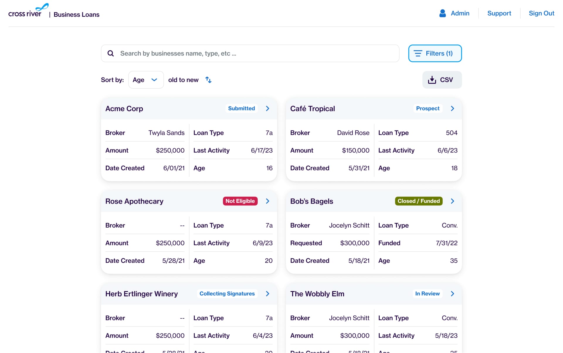
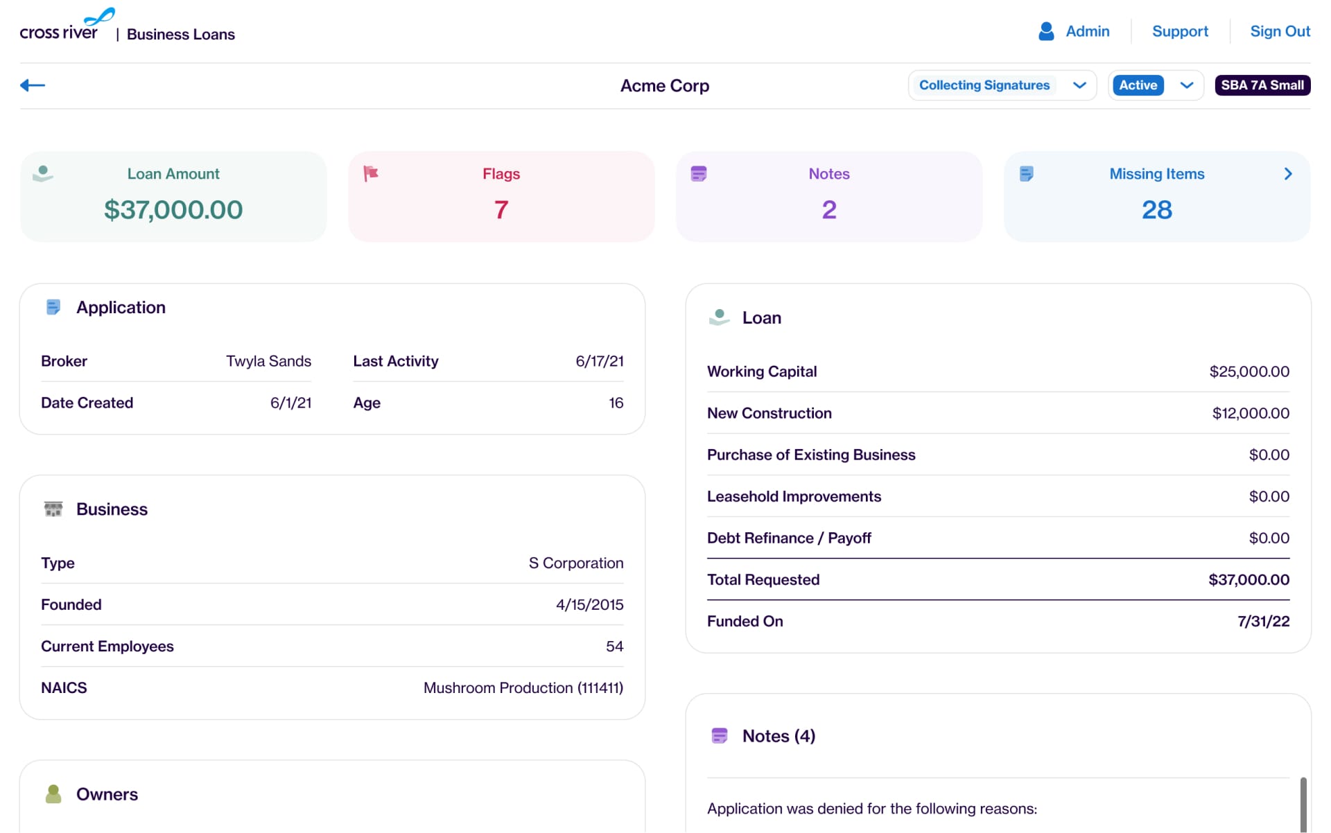
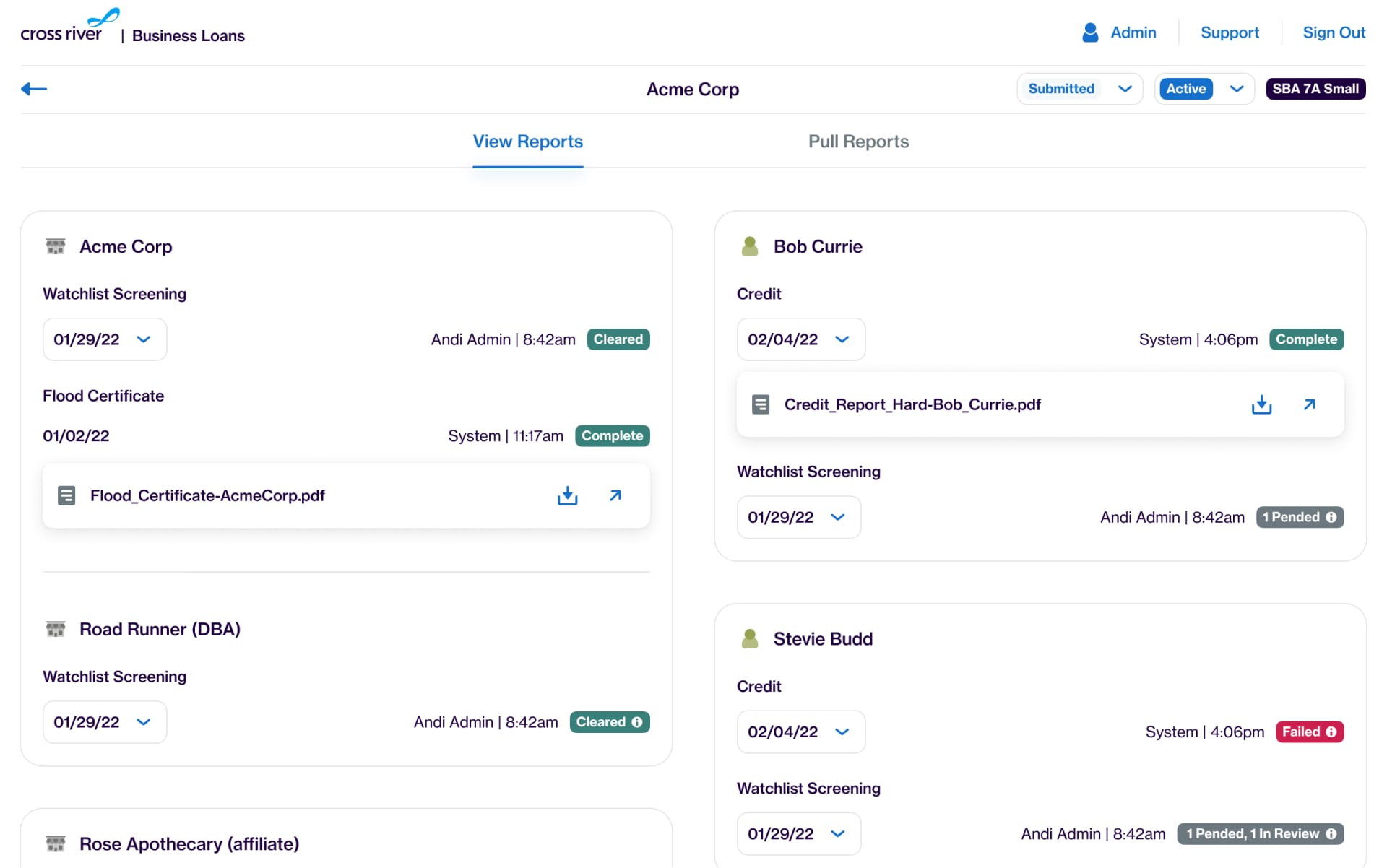
We decided to build an app that would accommodate and improve upon every workflow a reviewer and underwriter has—automating everything that doesn’t need to be manual. This app included:
- An interface to find, organize, and manage all loan applications.
- A dashboard with a birds-eye-view of the loan.
- A simplified and custom-tailored spreadsheet tool (à la Google Sheets) for underwriter calculations.
- A surface to run credit, watchlist, and third-party reports.
- A place to view and request loan documents.
- A communications hub for NOIs, Adverse Action Notices, etc.
Design
To address the problems and objectives outlined above, my designs achieved the following:
- Drastically sped up processing loans by incorporating automation and designing efficient workflows that live in one app.
- Introduced a spreadsheet tool for underwriters to perform their calculations in a consistent and custom-tailored fashion.
- Provided a central hub for managing and requesting loan documents.
- Created systems for managing and automating application life-cycle.

Results
With the introduction of these two apps, we saw a 75% reduction in time to process and fund a loan application. There was also a 50% increase in loans funded over the course of the year following their releases. The project is still live, continues to evolve, and was considered a huge success—exceeding targets and predictions.


